TOPCAT Screenshots
TOPCAT Screenshots
TOPCAT Screenshots
This page shows some screenshots displaying some of the new visualisation features in TOPCAT Version 3 (released July 2007). The main things on show here are:
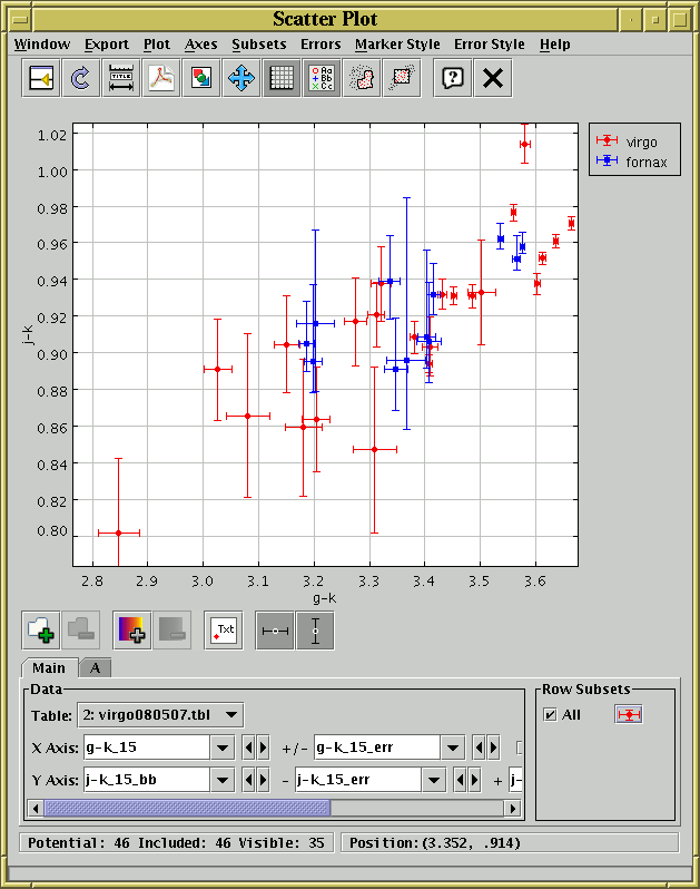
This shows a simple 2D scatter plot with error bars in X and Y. The X axis error bars are symmetric, while the Y error bars have different values for lower and upper bounds. Two sets of data are plotted, comparing colour-colour diagrams for galaxy samples in two regions of the sky.
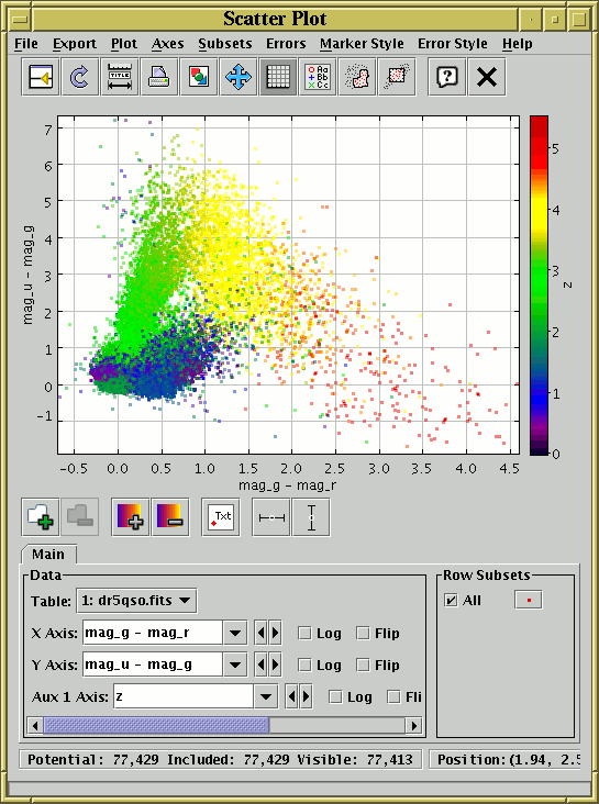
This shows a nice colour-colour plot (G-R vs. U-G), colour-coded by redshift, for a catalogue of SDSS QSOs. The form of the plot is determined by the QSO emission peak around 1000 Angstrom moving into the g band near z=2.3, and then into the u band near z=4.
Thanks to Evanthia Hatziminaoglou for this figure.
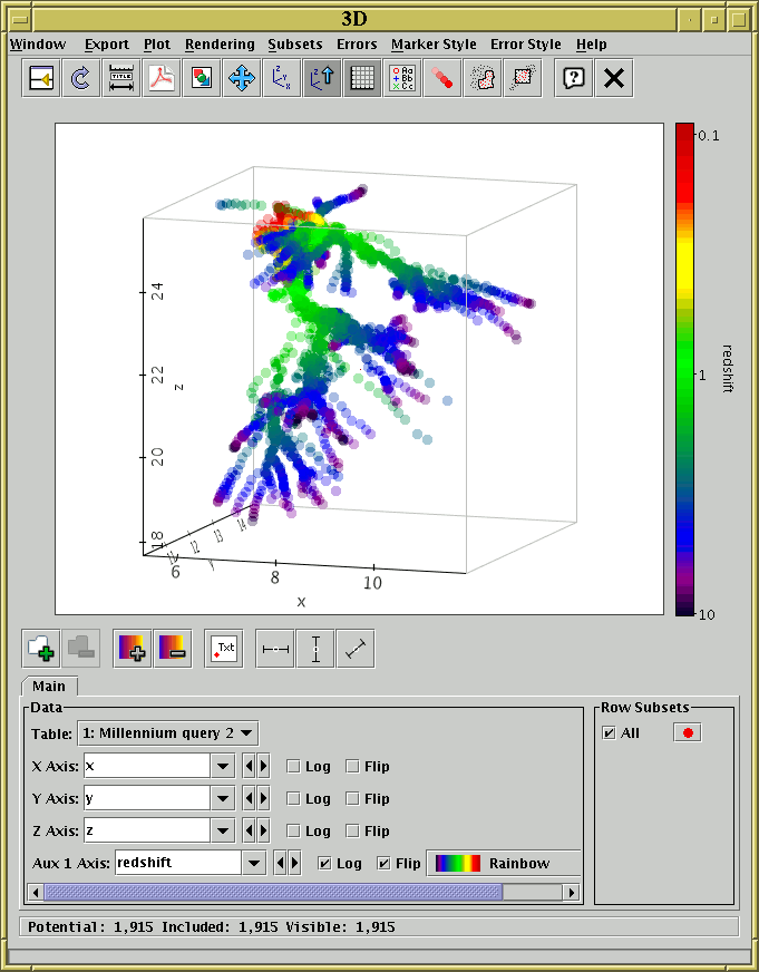
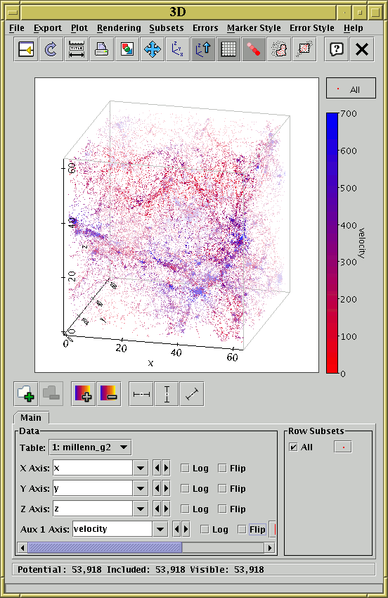
Simulation results are plotted here on 3D Cartesian axes, where the coordinates are the spatial coordinates of particles in the simulation. Each plotted point is colour-coded to indicate the redshift (which corresponds to a simulation timestep) at which the particle was observed. This effectively visualises the fourth dimension. When running the program, you can rotate the plot interactively in the spatial dimensions which gives an even better idea of the three-dimensional structure.
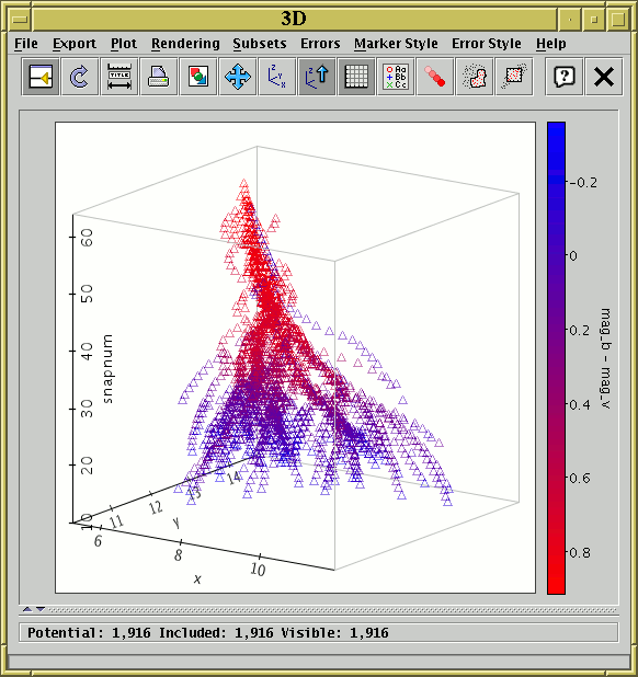
The following figure is similar, but in this case the spatially displayed dimensions are X, Y and timestep, and the galaxy colour is displayed on an auxiliary axis (redder points are redder galaxies). The data was obtained using the following query on the GAVO Millennium database:
   SELECT p.snapnum, p.x, p.y, p.z, p.mag_b, p.mag_v
     FROM millimil..delucia2006a d, millimil..delucia2006a p
    WHERE d.galaxyid = 0
      AND p.galaxyid BETWEEN d.galaxyid AND d.lastprogenitorid
The data selector panel has been hidden to facilitate display on a
smaller screen.
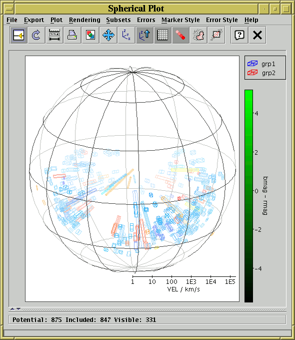
Points with a sky position and a radial coordinate (this may represent either spatial position from the centre or some notional non-spatial coordinate) are plotted within a spherical grid. Each point has additionally a tangential error (size or error on the plane of the sky) and a radial error. In this case the region corresponding to each point is marked out by a wire-frame cuboid, though a wide range of other representations is possible. Two different datasets are represented, in colours which are basically red or blue. However, and additional parameter (R-B colour) scales the green component of each point, so that objects whose detected colour are blue are more green in the plot (so bluer grp1 objects look more cyan and bluer grp2 objects look more yellow).
The point selector panel at the bottom of the plot has been collapsed out of view in this case to economise on screen space.
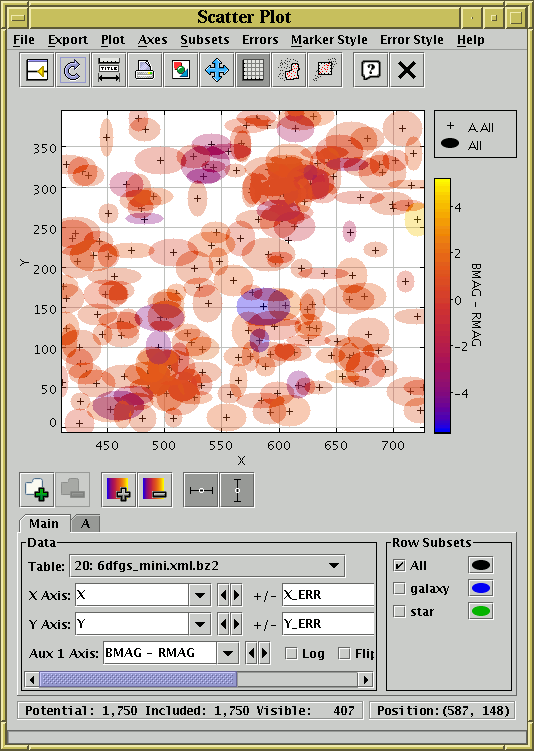
This shows a 2D scatter plot with X and Y errors. The error "bars" here are represented as partially transparent ellipses. An auxiliary axis is also used to display bluer objects (ones with a higher BMAG-RMAG value) as bluer on screen and redder objects as redder on screen.
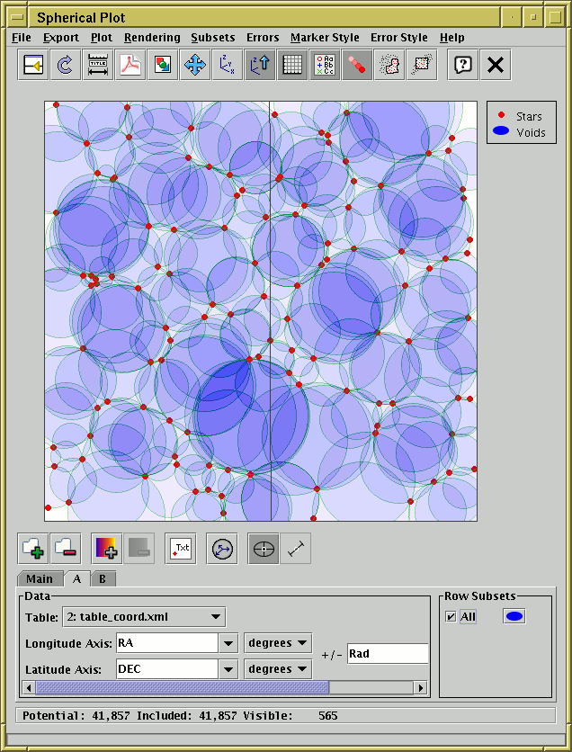
This is a spherical plot in which the red points are positions of stars, and the pale blue circles are maximal circular regions known to contain no stars. The circles (and their outlines, which are provided by a separate dataset using the same data) are actually "error bar" representations. Since the void regions are plotted using a fairly high transparency value, it's easy to see where some or many overlap.
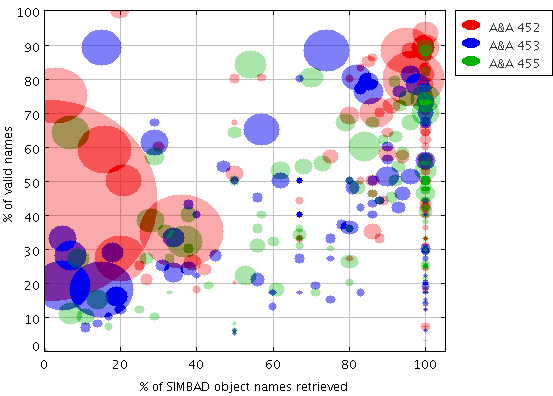
This plot uses the area of "error ellipses" to represent the significance of points — here each point represents a paper published in Astronomy & Astrophysics and the size of the point represents the number of astronomical objects referenced in that paper. This use of "error bars" for purposes other than representing errors is a good way to display higher-dimensional aspects of the data. The graphic here is the result of exporting from plot window to an image rather than a screenshot of TOPCAT at work, so the figure is presented on its own without the surrounding window.
Thanks to Sébastien Derriere for this figure.
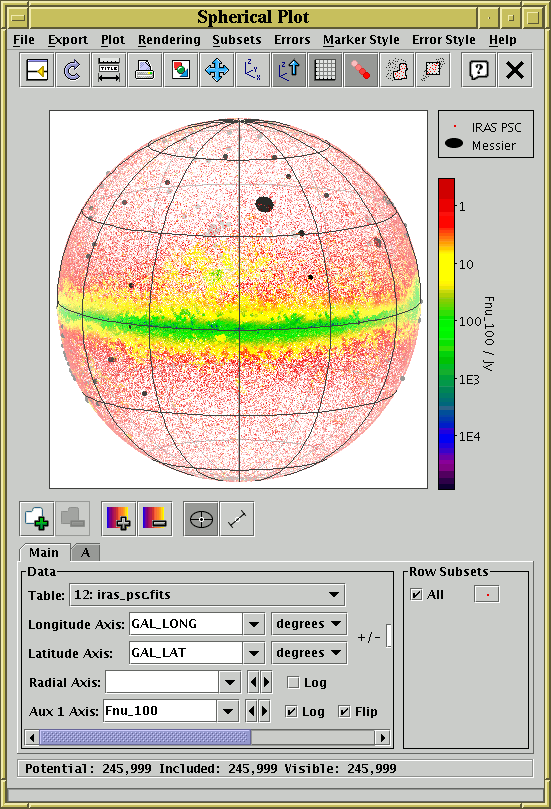
This shows the entire IRAS point source catalogue plotted on a sphere, with an auxiliary axis colouring points according to their flux at 100 microns. It's clear that objects in the galactic plane tend to be much brighter at this wavelength than those near the poles.
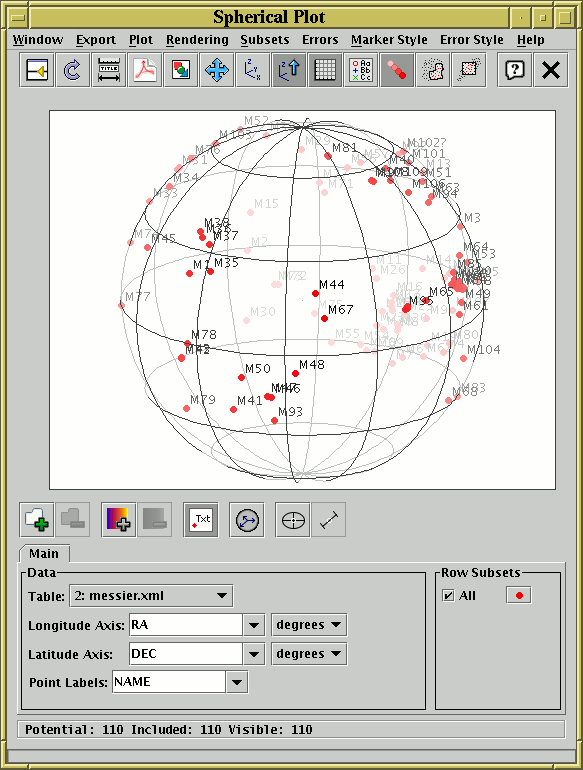
The Messier objects are also overplotted in black, with sizes corresponding to their size on the sky.
Particle positions from a single snapshot of a simulation are shown. They are colour coded by absolute velocity.
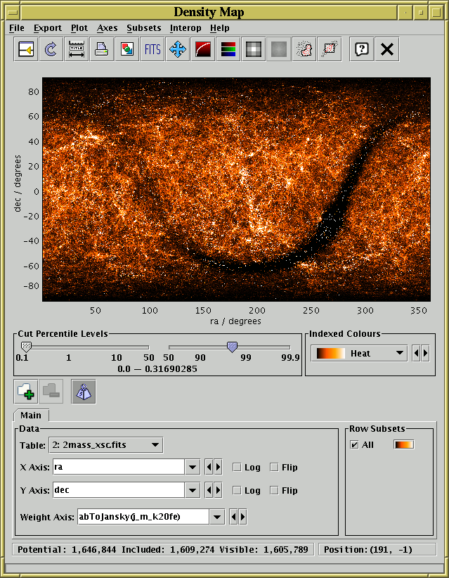
A density map of the entire 2MASS extended source catalogue is shown.
Since the quantity abToJansky(j_m_k20fe)
is used as a weighting parameter, the colour of each pixel corresponds
to the total flux emitted in the J band by 2MASS extended sources
in the area of that pixel.
The "Heat" colour map has been selected to give improved contrast in
the resulting image.
This shows a plot of all the Messier objects on the sky, labelled with their Messier IDs. This is achieved by filling in the Point Labels selector with the "NAME" column. This kind of labelling can be done in the other 2d and 3d scatter plots as well.