Next Previous Up Contents
Next: Stacked Line Plot (old-style)
Up: 2D Plot (old-style)
Previous: 2D Plot (old-style)
When plotting points in a scatter plot there are many different
ways that each point can be displayed. By default, TOPCAT chooses
a set of markers on the basis of how many points there are in the
table and uses a different one for each plotted set. The marker for
each set is displayed in a button to the right of its name in the
dataset selector panel at the bottom of the plot window. If you
click this button the following dialogue will pop up which enables
you to change the appearance.
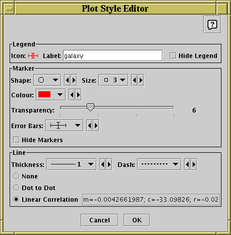
Style editor dialogue for 2d scatter plot
The Legend box defines how the selected set will
be identified in the legend which appears alongside the plot
(though the legend will only be visible if Show Legend
( ) is on):
-
Icon
- Displays the icon which will be shown to identify the points in
the selected set. Its appearance depends on the selections you
make in the rest of this dialogue window.
-
Label
- Gives the name written in the legend to label the subset.
By default this is derived from the Row Subset's name and, if it's
not part of the main dataset, the name of the dataset's tab.
You can type in a new value to change what is written in the legend.
-
Hide Legend
- If this checkbox is selected, then no entry for the selected set
will appear in the legend.
The Marker box defines how the markers plotted for
each data point will appear:
-
Shape
- Choose from a variety of shapes such as open or filled
circles, squares, crosses etc.
-
Size
- Choose the size of the marker; the value given is approximate radius
in pixels. If a size of zero is chosen, then the shape doesn't matter,
the points will be plotted as single pixels.
-
Colour
- Choose the colour in which the markers, and
any line if one is drawn, will be plotted.
-
Transparency
- Choose transparency of the plotted symbols.
The scale on the slider is logarithmic, with 1 at the left hand end.
The actual value chosen is an integer written at the right of the
slider. This number gives the number of markers for this set which
need to be plotted in the same position to result in fully opaque
pixels - any fewer and the background, or other markers plotted
underneath, will show through to some extent.
Setting this to some value greater than 1 is very useful if you
have a very large number of points being plotted (especially if it's
comparable with the number of the pixels on the screen), since it
enables to you distinguish regions where there are lots of points
on top of each other from those where there are only a few.
-
Error Bars
- If error bars are active for this plot,
allows you to select the way they will appear. The options which
can be selected here will depend on whether X and/or Y errors are
in use.
-
Hide Markers
- This check box is only enabled if a line and/or error bars
are being plotted; it allows the markers to be invisible,
so that only the line/error bars are seen.
The Line box determines if any lines are drawn associated
with the current set and if so what their appearance will be.
-
Thickness
- Selects the line thickness in pixels.
-
Dash
- Selects a dash pattern (solid, dotted, dashed or dot-dashed) for
the line.
-
Type
- The other radio buttons determine what kind of line, if any,
will be plotted for these points. There are three options:
-
None
- No line is drawn - this is the default.
-
Dot to Dot
- A straight line segment is drawn between each of the points.
If the points effectively form an ordered set of samples of a
function, this will result in a more-or-less smooth drawing of
that function on the plot. Note that the lines are drawn in
the order that the points appear in the basic table, and if
this doesn't match the 'ordinate' order the result will be a mess.
Really, the drawing order ought to be the table's current sort
order - that it is not is a misfeature which may be corrected
at some point.
Note also that if you try this with a huge table you're likely
to get a result which (a) is messy and (b) takes a very long time
to draw.
-
Linear Correlation
- If you select this option then a linear regression line will
be plotted. The correlation coefficients will also be displayed
to the right of the radio button (you may need to resize the
window to see them all). The values cited are
m (gradient), c (intercept) and
r (product moment correlation coefficient).
You can cut and paste from this text.
Note that for both the plotted line and the
quoted coefficients the data is taken only from the points which
are currently visible - that means that if you've zoomed the
axes to exclude some of the data points, they will not be
contributing to the calculated statistics.
Any changes you make in this window are reflected in the plot straight
away. If you click the OK button at the bottom, the window
will disappear and the changes remain. If you click Cancel
the window will disappear and any changes you made will be discarded.
You can also change all the plotting styles at once by using the
Marker Style menu in the plot window.
Here you can select a standard group of styles (e.g. all open 2-pixel
markers with different colours and shapes) for the plotted sets.
Similarly, error styles can be changed all at once using the
Error Style menu.
Next Previous Up Contents
Next: Stacked Line Plot (old-style)
Up: 2D Plot (old-style)
Previous: 2D Plot (old-style)
TOPCAT - Tool for OPerations on Catalogues And Tables
Starlink User Note253
TOPCAT web page:
http://www.starlink.ac.uk/topcat/
Author email:
m.b.taylor@bristol.ac.uk
Mailing list:
topcat-user@jiscmail.ac.uk