 TOPCAT V4 Plotting
TOPCAT V4 Plotting
TOPCAT V4 Plotting
This page gives a short introduction including some screenshots to the new visualisation features in TOPCAT Version 4 (beta release in v4.0b March 2013, first non-experimental release v4.1 March 2014).
(Note: the screenshots on this page are mostly from v4.0b, and the user interface differs a bit from v4.1 and later)
The main things on show here are:
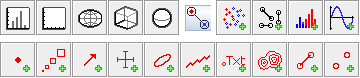
This is a colour-magnitude diagram of 8 million points from the Gaia Universe Model Snapshot simulation of the Large Magellanic Cloud. Points are plotted individually, but where multiple points are overplotted, the colour is darkened. This colouring mode, known as "auto", is now the default for 2d, so scatter plots will initially look like this. For non-overlapping points (in a crowded plot, outliers), it's exactly the same as a normal plot with opaque markers ("flat" mode), but it's also easy to see where the overdense regions are. It is something like what the density map (2d histogram) or plot with transparency did in classic TOPCAT plots, but with those capabilities it was hard to see both the overdense regions and the outliers at the same time.
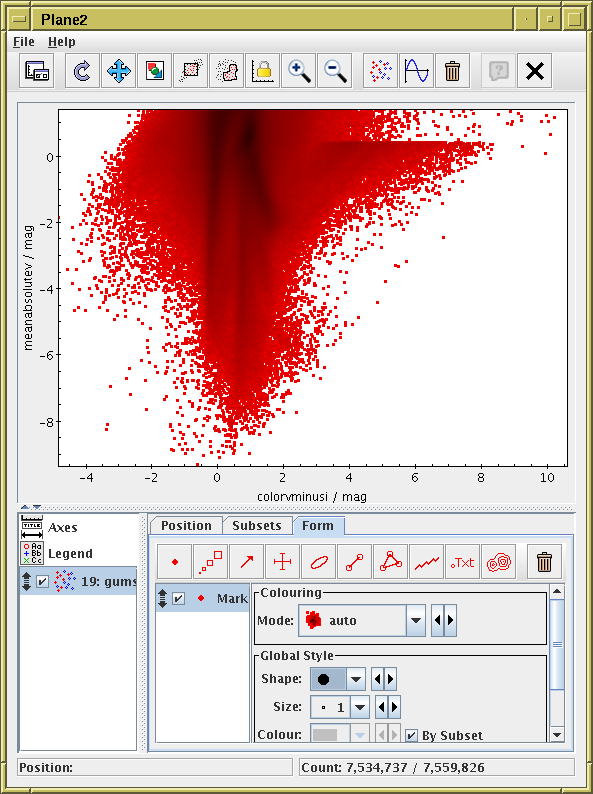
Below is the same data with some adjustments to the plotting. The colouring mode "density" is now used, with a rainbow colour map. This makes it easier to see the density structure for a single-component plot, but can be confusing if multiple datasets or row subsets are being plotted at once.
Additionally, density contours have been overplotted in black. Slider controls make it easy to change the scaling and position of both the contour and colourmap scaling, so you can sweep the lines and colouring around to see where the interesting features lie.
The axes have been labelled using LaTeX typesetting to get subscripts etc.
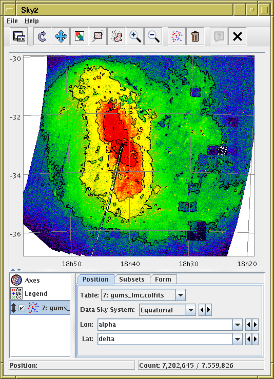
Positional plot of the same data as the previous item. This plot is similar, but this time showing Galactic Longitude/Latitude on sky axes. Although the supplied data coordinates are equatorial (RA/Dec), an option in the Projection tab of the Axes control projects them into galactic coordinates. It's easy to see here various artifacts of the simulation.
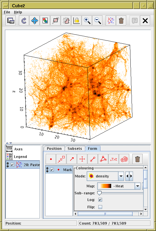
Density shading can be done on 3d plots as well (it looks better when you can rotate it).
Note that the use of density shading in 3d presents some problems that do not arise in 2d, to do with where in the depth direction the opaque density pixels are considered to lie. As a rule of thumb, only use density shading for single-dataset plots, or prepare to be visually confused. The default colouring mode for 3d plots is therefore flat, not auto as it is for 2d.
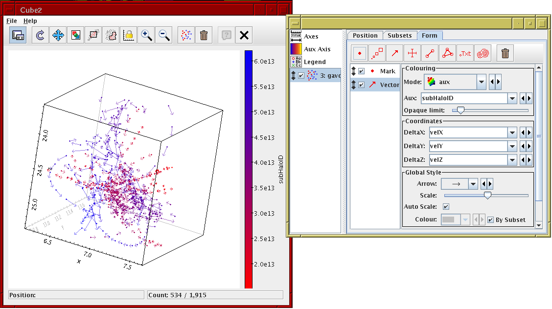
This shows some 3D simulation data with positions and velocity vectors. Points are also coloured by an ID value.
To look closer at a particular part of the plot you can right-click on the relevant point to recenter it in the cube, then you can zoom in and out with the mouse wheel (the wireframe cube stays the same size, but the data volume in it gets bigger or smaller). This makes it quite easy to navigate around the data at various scales. Dragging the cube with the left mouse button rotates it.
The Auto Scale toggle in the control window means that the arrow lengths are automatically scaled to be a sensible size for the plot; this scaling can be adjusted interactively using the Scale slider.
Here the control panel has been floated out of the plot display
window into a separate window for convenience,
using the leftmost button in the toolbar
(![]() ).
).
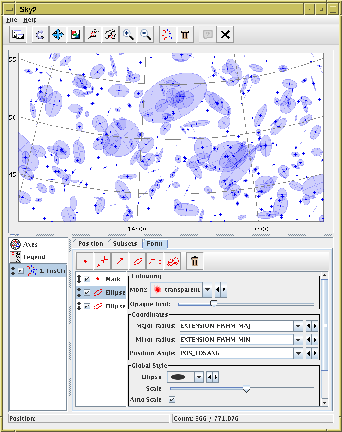
This shows part of a sky plot with galaxy positions and ellipses (defined by major radius, minor radius and position angle). Here the ellipse sizes have been artificially inflated (using the Scale slider) for effect.
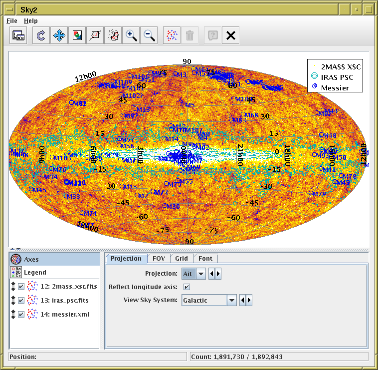
This is an all sky plot using the Aitoff projection into a galactic sky system. Three data sets are overplotted; the 2MASS extended source catalogue as a density plot with a yellow/purple colour map; the IRAS Point Source Catalogue using cyan contours, and Messier catalogue point sources plotted and labelled in blue.
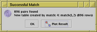
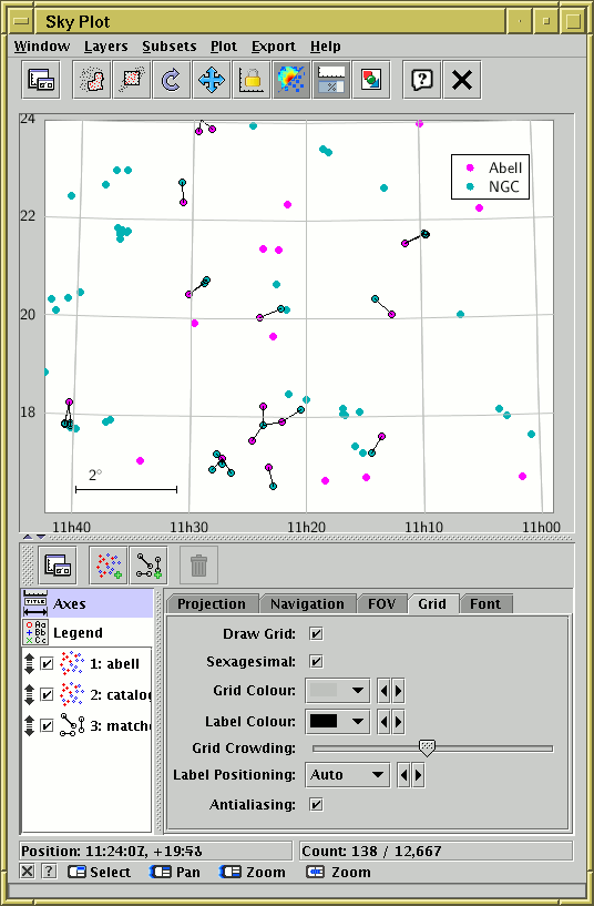
This shows the input catalogues and results for a crossmatch. The input catalogues are plotted in magenta and cyan respectively. Each output row (matched pair) is shown as a line between the matched positions. This can be very useful to see which correspondences the crossmatch actually made.
Following a successful pair match, you are now given the option to generate a plot like this automatically: just hit the Plot Result button when you see this dialogue:
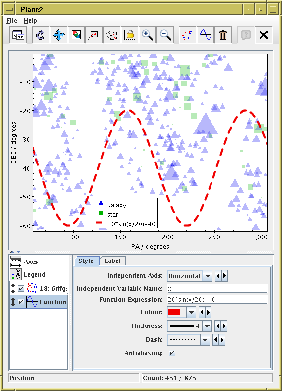
This plot shows markers scaled in size by one of the table columns. Two different subsets of the same table are shown. A sine curve has been gratuitously plotted over the result to show how analytic functions can be displayed.
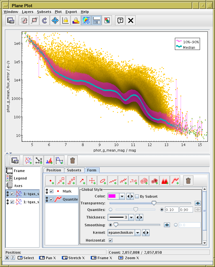
This plot shows how you can trace the median and other quantiles of a plot to display the trend of a noisy scatter plot. Two layers are used, one filling the region between the 10th and 90th percentiles, and one the median. Smoothing can be applied to get rid of the noise if required, though it has not been in this case.
(For full details, see the manual)
The new plots are now visible in the main Control Window toolbar:
As in the classic plots, as soon as you open one of the plot windows, as long as you have a table loaded and selected, you will usually see a starting plot, and you can play around with the controls to get what you want.
The control stack on the bottom left initially has fixed entries, for configuring plot Axes, and the Legend. Below that is a list of plot layer controls. To start with, one is automatically present, but you can add more using the controls in the lower tool bar. Selecting any of these controls by clicking on the stack entry on the left shows a panel with multiple tabs on the right. Explore these tabs for configuration of the plot. Some of these tabs in turn (Subsets, Form) have similar control stacks: click on the entry in the stack on the left to see the corresponding configuration panel on the right.
Each of the control stack items in the list has a checkbox, which you can (un)check to (de)activate that control, and a grab handle, which you can use to drag it up and down to change the position of the corresponding plot layer(s); items lower down the stack are plotted over (and hence may obscure) items higher up.
The data plot controls have three tabs:
The whole control panel at the bottom of the plot window
can be floated out into
a separate window by using the Float Controls
(![]() ) button in either of the toolbars.
This may be particularly useful if you have a screen with not many
pixels vertically. Once floated, the control panel can be returned
to the plot window by closing it, or by hitting the same button again.
) button in either of the toolbars.
This may be particularly useful if you have a screen with not many
pixels vertically. Once floated, the control panel can be returned
to the plot window by closing it, or by hitting the same button again.
The controls are generally more responsive than in classic plots: any change to the controls updates the plot immediately.
The GUI is somewhat more complicated to drive than for the old-style plots, and may be changed in a future release depending on user feedback. However, the hope it should be easy to make straightforward plots, and with a bit of playing around it should be possible to work out how to make more sophisticated plots.
Mouse interaction with the plots have changed (also since v4.0), and the navigation is much more responsive. It's much easier to navigate round 3d plots especially than it used to be; a 3d zoom now leaves the axis cube in the same place, but zooms the space within it, which works much better than the old-style plots.
The short story is:
There are however quite a few more options. Detailed navigation help is available for each window in the footer panel (below) or by clicking the little question mark in it.
Full documentation can be found in the manual.
For many things, the code is in better shape for future improvements than the old-style plots (which is another way of saying that much of the benefit delivered by this plotting overhaul hasn't happened yet). I have a lot of things on the to-do list, but the priority of different items is still to be worked out. If there are things not here or insufficiently developed that you'd like to see, please get in touch either on the mailing list or direct to me. Some of the things on the drawing board for near or far future are: