Next Previous Up Contents
Next: Density Style Editor
Up: Old-Style Plot Windows
Previous: Spherical Plot (old-style)
This section describes an old-style plotting window.
The standard plotting windows are described in Appendix A.4.
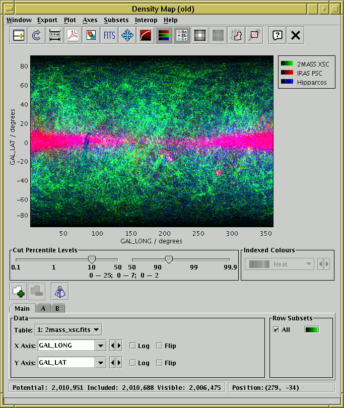
Density map window in RGB mode
The density map window plots a 2-dimensional density map of
one or more pairs of table columns (or derived quantities);
the colour of each pixel displayed is determined by the number of
points in the data set which fall within its bounds.
Another way to think of this is as a histogram on a 2-dimensional
grid, rather than a 1-dimensional one as in the
Histogram Window.
You can optionally weight these binned counts with another value
from the table.
Density maps are suitable when you have a very large number of points
to plot, since in this case it's important to be able to see not just
whether there is a point at a given pixel, but how many points fall
on that pixel. To a large extent, the transparency features of the
other 2d and 3d plotting windows address this issue, but the
density map gives you a bit more control. It can also export
the result as a FITS image, which can then be processed or viewed
using image-specific software such as GAIA or Aladin.
This window can be operated in two modes:
-
Indexed Mode
- Each pixel represents a single scalar value, corresponding to a
count or sum as indicated by the selected dataset(s). If multiple
datasets are being plotted at once, the values from each will be
summed to give the result at each point. The mapping from numeric
value to pixel colour at each point on the plot is determined by
the colour map selected in the Indexed Colours
selector below the plot. In this case the style editor colour selectors
have no effect and are disabled.
A fairly wide range of colour maps is provided by default.
If these do not suit your needs, it is possible to provide your own
custom colour maps using the lut.files system property -
see Section 10.2.3.
-
RGB Mode
- Each pixel has up to three independent contributions, its
intensity in Red, Green and Blue channels. These can come from
different datasets, as configured in the
style editor. If more than one
dataset is assigned the same colour, the contributions are summed
for that channel.
In this case the Indexed Colours colour map selector has no effect
and is disabled.
Switch between the modes using the RGB ( ) button.
You can configure the axes, including zooming in and out,
with the mouse (drag on the plot or the axes)
or manually as described in Appendix A.5.1.2.
Two controls specific to this window are shown below the plot itself:
-
Cut Percentile Levels
- This controls how the number of counts in each pixel maps
to a brightness.
There are two sliders, one for the lower bound and one for the upper bound.
They are labelled (logarithmically) with percentile values.
If the upper one is set to 90, it means that any pixel above the 90th
percentile of the pixels in the image in terms of count level will be
shown with maximum brightness, and similarly for the lower one.
These values apply independently to each colour channel if more than
one is in use.
Immediately below the sliders, the pixel values which correspond to
minimum and maximum brightness are displayed. In indexed mode there is
one range, and in RGB mode there may be up to three.
If the image is not fairly completely covered, this control doesn't
give you as much freedom as you might like - the user interface may
be improved in future releases.
-
Indexed Colours
- When in indexed (non-RGB) mode only, this allows you to select
a colour map which determines how pixel values (counts or sums per bin)
are turned into colours on the screen. The lowest value corresponds to
the colour at the left side of the icon and the highest value to the right
side. In RGB mode this is disabled.
The following buttons are available on the toolbar:
-
 Split Window
- Allows the dataset selector to be resized by dragging a separator
between it and the plot area. Good for small screens.
-
 Replot
- Redraws the current plot. It is usually not necessary to
use this button, since if you change any of the plot characteristics
with the controls in this window the plot will be redrawn
automatically. However if you have changed the data, e.g. by
editing cells in the Data Window,
the plot is not automatically redrawn (since this is potentially an
expensive operation and you may not require it).
Clicking this button redraws the plot taking account of any changes
to the table data.
-
 Configure Axes and Title
- Pops up a dialogue to allow manual configuration of axis ranges,
axis labels and plot title - see Appendix A.5.1.2.
-
 Export as PDF
- Pops up a dialogue which will write the current plot as a PDF file.
-
 Export as GIF
- Pops up a dialogue which will output the current plot to a GIF file.
The output file is just the same as the plotted image that you see.
Resize the plotting window before the export to control the size
of the output GIF.
-
 Export as FITS
- Pops up a dialogue which will output the plotted map as a FITS array.
If only one channel is visible (either one colour channel or indexed
mode) then the output FITS file will be a 2d array with dimensions the
same as the displayed image. If there are multiple RGB channels then
the output array will be 3d with the third dimension having an extent
of 2 or 3, depending on the number of colour channels visible.
In either case the FITS file will have a single (primary) HDU.
Basic coordinate system information, as well as DATAMIN and DATAMAX cards,
will be written to the header.
The type of the output array will be double precision for weighted
values, or some integer type of sufficient length for unweighted ones.
-
 Rescale
- Rescales the axes of the current plot so that it contains all
the data points in the currently selected subsets.
By default the plot will be scaled like this, but it it may have changed
because of changes in the subset selection or from zooming in or out.
-
 Log Intensity
- Toggles between linear and logarithmic mapping for colour intensity
as a function of number of counts.
-
Colour
- Toggles between indexed and RGB modes (see the explanation above).
-
 Show Legend
- Toggles whether a legend showing how each data set is represented
is visible to the right of the plot. Initially the legend is shown
only if more than one data set is being shown at once.
-
 Bigger Pixels
- Increments the size of screen pixel corresponding to one density
map bin.
-
 Smaller Pixels
- Decrements the size of screen pixel corresponding to one density
map bin.
-
 Draw Subset Region
- Allows you to draw a region on the screen defining a new
Row Subset. When you have finished
drawing it, click this button again to indicate you're done.
See Appendix A.5.1.6 for more details.
-
 Subset From Visible
- Defines a new Row Subset
consisting of only the points which
are currently visible on the plotting surface.
See Appendix A.5.1.6 for more explanation.
The Dataset Toolbar contains the following options:
-
 /
/  Add/Remove dataset
- Adds/removes tabs in which the data for extra datasets can be entered.
See Appendix A.5.1.1.
-
 Weight Counts
- If this toggle button is on, an additional Weight Axis
selector appears below the X Axis selector.
If this is filled in with a column name or expression, then instead of
simply accumulating the number of points per bin, each pixel will
represent the sum over the weighting quantity for points in each bin.
Not having a weight axis is equivalent to filling in its value with
the quantity 1.
Note that with weighting, the figure drawn is no longer strictly speaking
a histogram or density map.
The Export menu provides a number of ways to export the
displayed image for external viewing or analysis.
As well as options to export as GIF, JPEG, EPS and FITS,
there is also the option to transmit the FITS image to one or
all applications listening using the SAMP or PLASTIC tool interoperability
protocol which will receive images.
In this way you can transmit the image directly to SAMP/PLASTIC-aware
image manipulation tools such as GAIA or Aladin.
See Section 9 for more information about tool interoperability.
How to set the colour channel corresponding to each dataset is
explained in the following subsection.
Next Previous Up Contents
Next: Density Style Editor
Up: Old-Style Plot Windows
Previous: Spherical Plot (old-style)
TOPCAT - Tool for OPerations on Catalogues And Tables
Starlink User Note253
TOPCAT web page:
http://www.starlink.ac.uk/topcat/
Author email:
m.b.taylor@bristol.ac.uk
Mailing list:
topcat-user@jiscmail.ac.uk