Next Previous Up Contents
Next: Density Map (old-style)
Up: Old-Style Plot Windows
Previous: 3D Plot Style Editor
This section describes an old-style plotting window.
The standard plotting windows are described in Appendix A.4.
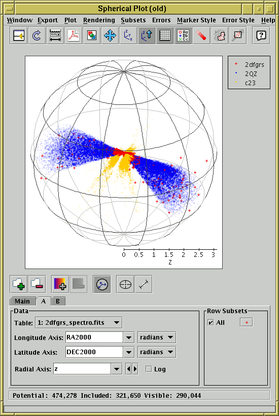
Spherical plot window
The spherical plot window draws 3-dimensional scatter plots
of datasets from one or more tables on spherical polar axes,
so it's suitable for displaying the position of coordinates on
the sky or some other spherical coordinate system, such as the
surface of a planet or the sun.
You can display it using the Sphere ( ) item
in the Control Window's
Graphics menu.
) item
in the Control Window's
Graphics menu.
In most respects this window works like the
3D Plot window,
but it uses spherical polar axes rather than Cartesian ones,
You have to fill in the
dataset selector
at the bottom with longitude- and latitude-type coordinates
from the table.
Selectors are included to indicate the units of those coordinates.
If TOPCAT can locate columns in the table which appear to represent
Right Ascension and Declination, these will be filled in automatically.
If only these two are filled in, then the points will be plotted on
the surface of the unit sphere - this is suitable if you just want to
inspect the positions of a set of objects in the sky.
If the Radial Coordinates ( ) button is
activated, you can optionally fill in a value in the
Radial Axis selector as well.
In this case points will be plotted in the interior of the sphere,
at a distance from the centre given by the value of the radial coordinate.
) button is
activated, you can optionally fill in a value in the
Radial Axis selector as well.
In this case points will be plotted in the interior of the sphere,
at a distance from the centre given by the value of the radial coordinate.
The 3D space can be rotated by dragging the mouse around on the
surface - it will rotate around the centre of the sphere.
By default the points are rendered as though the 3D space is filled
with a 'fog', so that more distant points appear more washed out -
this provides a visual cue which can help to distinguish the depth
of plotted points. However, you can turn this off if you want.
If there are many points, then you may find that they're not all plotted
while a drag-to-rotate gesture is in progress. This is done to cut down on
rendering time so that GUI response stays fast. When the drag is
finished (i.e. when you release the mouse button) all the points will
come back again.
Zooming is also possible. You can zoom in around the
centre of the plot so that the viewing window only covers the middle.
The easiest way to do this is to use the mouse wheel if you have one -
wheel forward to zoom in and backward to zoom out.
Alternatively you can do it by dragging on the region to the left of
the plot, like the Axis Zoom in some of the 2-d plots.
Drag the mouse down to zoom in or up to zoom
out on this part of the window. Currently it is only possible
to zoom in/out around the centre of the plot.
When zoomed you can use the
Subset From Visible ( ) toolbar button
to define a new Row Subset consisting only of the
points which are currently visible.
See Appendix A.5.1.6 for more explanation.
) toolbar button
to define a new Row Subset consisting only of the
points which are currently visible.
See Appendix A.5.1.6 for more explanation.
Clicking on any of the plotted points will activate it -
see Section 8.
The following buttons are available on the toolbar:
-
 Split Window
- Allows the dataset selector to be resized by dragging a separator
between it and the plot area. Good for small screens.
-
 Replot
- Redraws the current plot. It is usually not necessary to
use this button, since if you change any of the plot characteristics
with the controls in this window the plot will be redrawn
automatically. However if you have changed the data, e.g. by
editing cells in the Data Window,
the plot is not automatically redrawn (since this is potentially an
expensive operation and you may not require it).
Clicking this button redraws the plot taking account of any changes
to the table data.
-
 Configure Axes and Title
- Pops up a dialogue to allow manual configuration of axis ranges,
axis labels and plot title - see Appendix A.5.1.2.
The only configurable axis range is the upper limit of the radial axis.
-
 Export as PDF
- Pops up a dialogue which will write the current plot as a PDF file.
In general this is a faithful and high quality rendering of what
is displayed in the plot window. However, if plotting is being done
using the transparent markers, the markers will
be rendered as if they were opaque.
Plots with very many points can result in rather large output PDFs.
-
 Export as GIF
- Pops up a dialogue which will output the current plot to a GIF file.
The output file is just the same as the plotted image that you see.
Resize the plotting window before the export to control the size
of the output GIF.
-
 Rescale
- Rescales the axes of the current plot so that it contains all
the data points in the currently selected subsets.
By default the plot will be scaled like this, but it it may have changed
because of changes in the subset selection.
-
 Reorient
- Reorients the axes of the current plot to their default position.
This can be useful if you've lost track of where you've rotated
the plot to with the mouse. This also resets the zoom level to
normal if you've changed it.
-
 Stay Upright
- Toggle button which when selected ensures that the north pole
(latitude = +90 degrees) is oriented vertically on the screen at all times.
By default this is on.
-
 Grid
Grid
- Toggles whether the spherical wire frame bounding the plot
is drawn or not.
-
 Show Legend
- Toggles whether a legend showing how each data set is represented
is visible to the right of the plot. Initially the legend is shown
only if more than one data set is being shown at once.
-
 Fog
Fog
- Toggles whether rendering is done as if the space is filled with fog.
If this option is selected, distant points will appear more washed out
than near ones.
-
 Draw Subset Region
- Allows you to draw a region on the screen defining a new
Row Subset. When you have finished
drawing it, click this button again to indicate you're done.
The subset will include points at all depths in the viewing direction
which fall in the region you have drawn.
See Appendix A.5.1.6 for more details.
-
Subset From Visible
- Defines a new Row Subset
consisting of only the points which
are currently visible on the plotting surface.
See Appendix A.5.1.6 for more explanation.
The following additional item is available as a menu item only:
-
 Antialias
- Toggles whether the axes and their annotations are drawn antialiased.
Antialiased lines are smoother and generally look more pleasing,
especially for text at a sharp angle, but it can slow the rendering
down a bit.
The Dataset Toolbar contains the following options:
-
 /
/  Add/Remove dataset
- Adds/removes tabs in which the data for extra datasets can be entered.
See Appendix A.5.1.1.
-
 /
/  Add/Remove auxiliary axis
- Adds/removes a selector for entering an auxiliary axis to modify
point colours etc.
See Appendix A.5.1.5.
-
 Toggle point labelling
- Allows text labels to be drawn near plotted points.
See Appendix A.5.1.4.
-
Toggle Radial Coordinates
- When activated, a column selector labelled Radial Axis
will be visible below the Longitude and Latitude Axis selectors.
This enables you to enter a value for the radial coordinate of each
point. If this is disabled, or if it has a blank value, then all
the points will have an assumed radial coordinate of unity and will
be plotted on the surface of the sphere.
-
 Toggle tangential error bars
- When activated, an additional column selector appears in the
dataset panel to the right of the Longitude and Latitude selectors,
along with its own unit selector. You can fill this in with an
isotropic error value representing the radius of a small circle
associated with the selected points, in units of arcsec, arcmin,
degrees or radians. This will cause 2-d error bars to be plotted.
You can configure their appearance (e.g. crosshairs, ellipses,
rectangles, ...) using the
style editor in the usual way.
See Appendix A.5.1.3 for more information.
-
 Toggle radial error bars
- Switches radial error bars on and off. See Appendix A.5.1.3.
This button will only be enabled if the Radial Coordinates are in use.
You have considerable freedom to configure how points are plotted
including the shape, colour and transparency of symbols and the representation
of errors if used. This works exactly as for the
Cartesian 3D plot as described in
Appendix A.5.5.1.
Next Previous Up Contents
Next: Density Map (old-style)
Up: Old-Style Plot Windows
Previous: 3D Plot Style Editor
TOPCAT - Tool for OPerations on Catalogues And Tables
Starlink User Note253
TOPCAT web page:
http://www.starlink.ac.uk/topcat/
Author email:
m.b.taylor@bristol.ac.uk
Mailing list:
topcat-user@jiscmail.ac.uk